
Take time to reflect.

Medito
A re-design of the mobile app for an excellent mindfulness resource.

Project Type
Redesign, Design Exercise
End
04/16/2025
Role
UX Designer, UX Researcher
Start
02/24/2025


Medito
~
a redesign
~
Medito ~ a redesign ~


Quick Links

01 Overview
What is Medito?
Medito is an excellent free mindfulness resource for everyone around the world to use. Medito is a non-profit organization that provides its services through government funding, grants and donations as their mission is to keep Medito free for free for everyone. What exactly is mindfulness? Well according to Medito, it is being fully aware of whatever is going on in your current experience, with acceptance and without judgement.
Mindfulness does not just mean meditation, it is the process of living in the present moment and not letting the past or future change your mood and outlook on life today. You can practice it while walking or playing a sport or spending time with your friends. Mindfulness in this digital age of hustling in a fast-paced environment is crucial in terms of stress management, mental health and peace. And what better way to improve your life than using a free resource that is available at any time and is in the palm of your hand.

Why a Redesign was needed.
02 The Problem

Though Medito is an excellent free resource, there are issues that plague mobile apps that rely solely on government grants and donations as a form of financial stability.
Some of their innovative iterations have aided users but there are certain issues that remain prevalent with the app in its current state.
Below are three of the common user pain points that have been found with Medito’s current mobile app:


03 The Design Process
My Creative Solution

The Double Diamond Design Process was used to separate the design process into 4 smaller phases comprised of two main phases: the problem phase and the solution phase.

Discover Phase
Recognize the problems at hand, conduct primary and secondary research, analyze the data from the research, complete a competitive audit
Primary research included exploring the Medito mobile app as well as their website to see if there are any outstanding design problems to be considered for the redesign.
Common Issues:
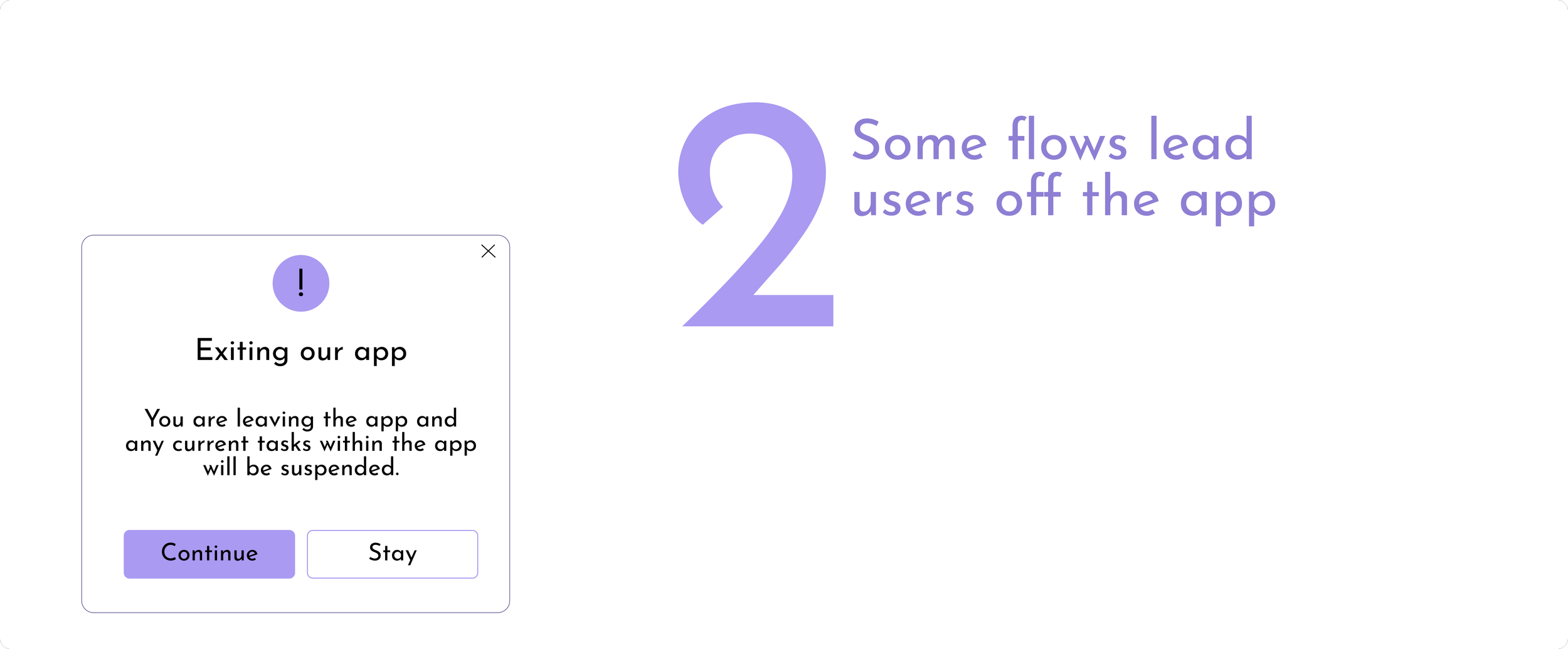
UI elements such as the cards in the “Explore” section are inconsistent in size and proportion
Some of the user flows within the app lead to external sites and links
Visual balance and layout can be simplified with an appropriate colour scale and typography (brand identity) to invoke more emotion into the user experience of the app
Secondary research involved conducting a competitive audit on the app and website for Headspace. Headspace is a resource that is a direct competitor to Medito as it allows users to focus on mindfulness and create a more peaceful life throught the act of being mindful.
Notes on Headspace:
Great visual balance and use of negative space
A clear brand identity with visual elements such as typography, iconography and images to invoke emotions
Great features such as suggested daily routine and reminders to keep users engaged

Additionally, some of the secondary research was done by using Apple Store and Google Play reviews of Medito’s mobile app.

Most of the Medito reviews were positive but of the negative ones, the common issues that apparent was to bring back the old and simple UI as it was easier to navigate.
Define Phase
Synthesize insights, add feature priorities and determine the requirements for the design solution
Key requirements were given priorities to determine what issues will be tackled first
P0 - high priority, needs to be included in the redesign
P1 - medium priority, important issue that should be incorporated and discussed in the redesign
P2 - low priority, if time permits this feature or requirement would be a bonus and improve the user experience of the redesign


Develop Phase
Conceptualize ideas (vision board, low-fidelity wireframes), explore visual identity (layouts, colours, typography) and start designing
Low-Fidelity Wireframes
〰️
Low-Fidelity Wireframes 〰️


Low-Fidelity Wireframes were made on paper than transferred to digital wireframes to conceptualize the new design of the Medito app
Typography
〰️
Typography 〰️


For the headings, the typeface Inter was chosen as it was a bold sans serif font that has a font weight to allow users to differentiate between important sections and tabs.
And as for the text, the typeface Josefin Sans was chosen as it was a playful font that pairs well with the emotions of joy and peace to align with Medito’s brand identity.
Colour Scale
〰️
Colour Scale 〰️

Design System
〰️
Design System 〰️


Deliver Phase
Presenting final designs with high-fidelity mockups and prototypes
Hi-Fi Mockup & Prototype
〰️
Hi-Fi Mockup & Prototype 〰️


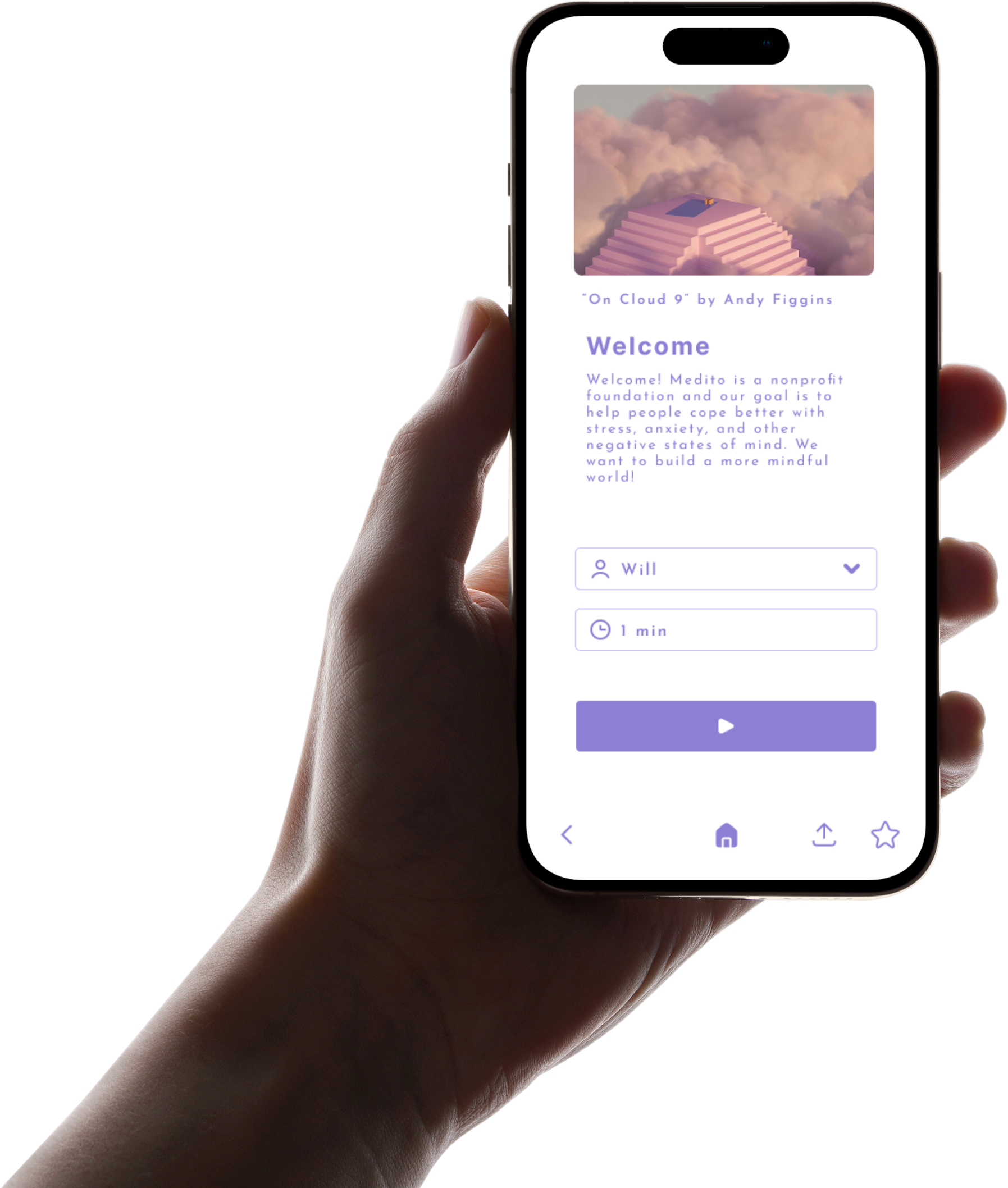
Light Mode at a glance
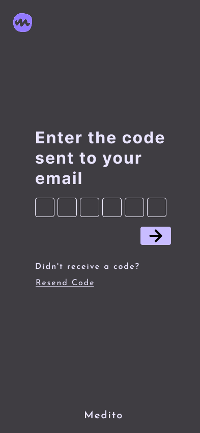
Dark Mode at a glance
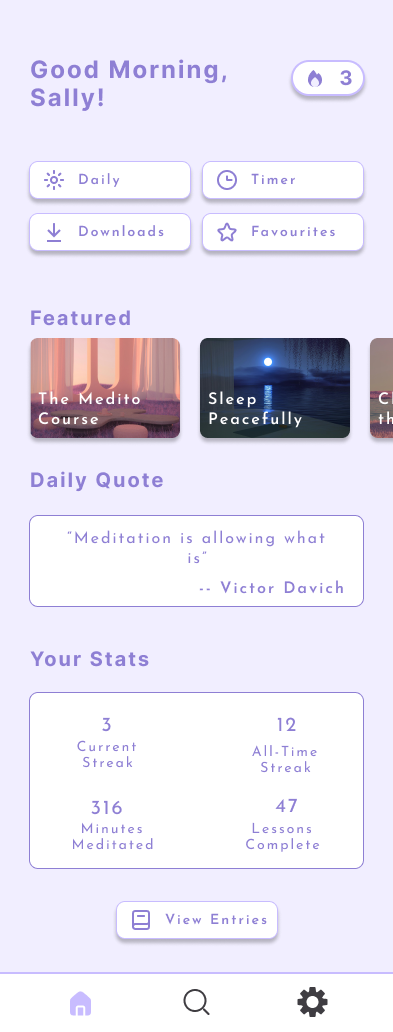

Home Screen and Navigation

04 Takeaways
What I Learned

The Design System role is very important; having local variables split into the Brand - Alias - Mapped - Responsive collections makes designing a lot easier and time efficient. The Brand collection encapsulates the entire range of colours then the Alias collection gives roles to the specific colours. Lastly, the Mapped and Responsive variables are key when it comes to auto-layout and responsiveness of your designs. The foundation of good design starts with a good design system.

Having a strong Brand Identity gives your product marketability; when it comes to designing a brand or an app, having a strong brand and visual identity gives users the chance to truly connect with your product or services. Key visual elements like typography and colour schemes will stand out to users and they will be able to associate it back to your app or product easily.

Redesigns give a different approach to crafting a design solution; there are some significant differences when designing a case study from scratch and doing a redesign on a preexisting mobile app. One key difference is you have a ton of user data and research to work with as most apps have a decent about of reviews/bugs on the App Store. The part that is most crucial is deciding what concepts are working well and should be kept and what new features or layouts should be explored.


05 Connect
Connect with Me
If you would like to provide feedback on this case study or would like to connect to collaborate on future projects, feel free to reach out to me via email at thamodh.e@gmail.com.
You could alternatively get in touch via my Contact Page:
View more of my work:

